LMS Design Best Practices
Practicing what you preach isn’t always as easy as it sounds. We took a step back and re-branded our internal LMS to follow our design best practices.
Your LMS should be an extension of your brand, but it wasn’t always ours. The system Wisetail uses to connect our clients and employees was far from our external brand.
We weren’t following our own best practices. Our messaging was off, our designs weren’t consistent, and we weren’t creating a simple platform for our company to connect. We decided it was time to rebrand our LMS.
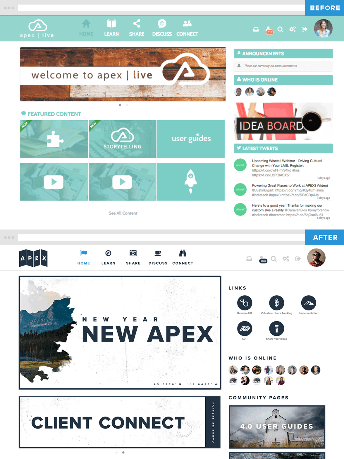
So, where did we start? How do you go from bad to fab in just a month’s time? We began by crafting an artist statement that reflected what we wanted to achieve:
“It is a new year, and this is a new Apex. Pulling inspiration from our surrounding area of Bozeman, Montana, we have redesigned Apex to better reflect our best practices. This redesign is a better reflection of the Wisetail brand and thematically presents our system as that mountain of learning. Think of the Learn tab like a compass, and the Share tab like your trusty camera you bring along the way; the Discuss tab is a group of L&D folks sharing thoughts around a cup of coffee, and the Connect tab is the binoculars you use to find one another. Happy trails!”
Our artist statement helped us visualize our direction before we began to build our brand assets for our LMS. We knew that we needed to better integrate our surrounding area and illustrate the mountain of learning for our users. So that’s what we did. We used Montana imagery, created gritty textures, chose icons that helped evoke camping in the mountains, and designed a logo that illustrated our trail map concept.

Gritty Textures
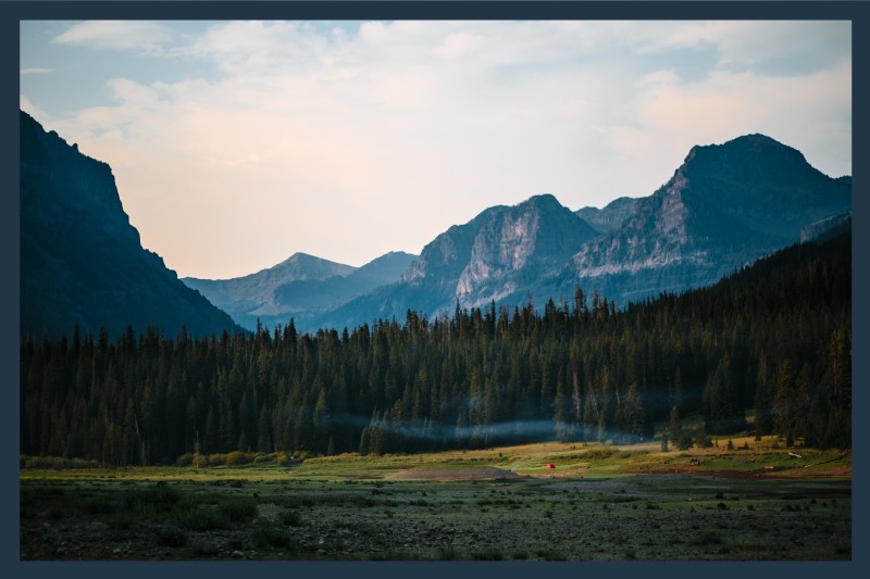
Montana Imagery
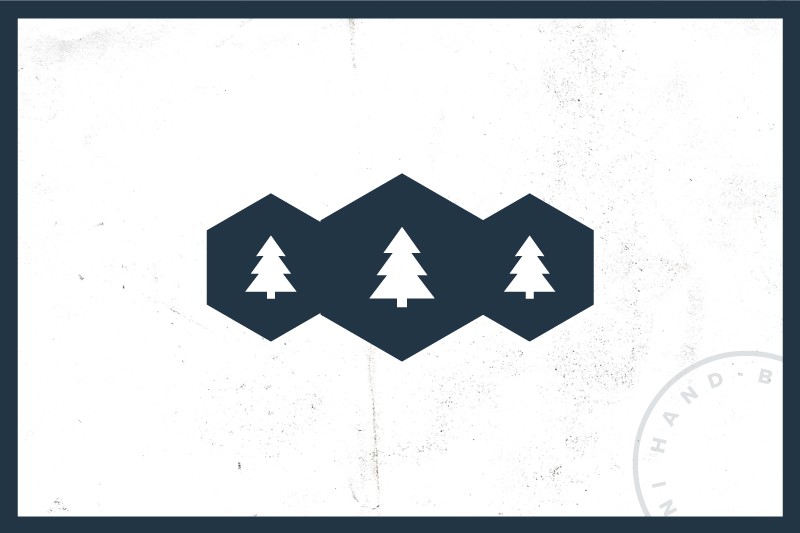
Nature Icons
Next, it was up to us to hold our feet to the fire and follow our best practices.
Keep it simple
Think of your graphics as teaser photos for your content. Draw your users in by creating original graphics and limiting the amount of words on your banners and thumbnails. Utilize them as forms of navigations with a clear call to action.
Employ your brand
What are the strongest elements of your brand? Color? Photography? Iconography? Make note of where you excel and use them to your advantage.
Utilize original photography
Use imagery from your company, not stock photos. Authenticity is as important as ever in the age of social media, and your users know this. Encourage them to share their original photography through user contributions.
Tell a story
A cohesive brand tells a story in both its graphics and messaging. Make it fun for users by crafting clever messaging and designs. Use a human-centered approach to your storytelling by using Design Thinking practices.
Establish consistency
Create a style guide for anyone posting in your LMS. Establish the basics of size and color for headlines, subheads, and body copy.
An LMS rebrand is tricky, and following these best practices can be tough, but establishing a set of guidelines will help usher in a new era of success for you and your users.


